

A maintenance dashboard is a live visual interface that turns work-order data, sensor readings, and CMMS records into KPIs such as MTTR, MTBF, and OEE, so teams can see asset health at a glance. Fullyops and similar platforms build these dashboards to sit in front of your CMMS, pulling the numbers technicians already log into a single screen a manager can read in under a minute.
The value shows up in three places straight away:
- Visibility: everyone from the shop floor to the boardroom sees the same numbers, not conflicting spreadsheets.
- Prioritisation: backlog and criticality scores tell planners which jobs actually need attention today.
- Faster corrective action: a spike in downtime or a failed sensor reading triggers a response in minutes rather than surfacing in next month’s report.
Dashboards sit at the front end of your maintenance toolchain, highlighting why regular maintenance prevents failures in facilities. Behind them, your CMMS or ERP stores the raw events; behind that, a BI layer like Power BI might handle deeper analysis. The dashboard is the part your team actually looks at every day.
Key Takeaways
A maintenance dashboard works because it converts live CMMS and sensor data into a small, agreed set of KPIs that drive faster corrective action.
| Point | Details |
|---|---|
| Define KPIs before building | Agree MTTR, MTBF, availability and OEE formulas in writing and validate them against historical data first. |
| Start with an operational dashboard | Pilot daily work management before attempting predictive or fleet-wide dashboards. |
| Fix your asset master data first | A single authoritative asset table prevents the KPI mismatches that undermine trust in the dashboard. |
| Cap the KPI count on screen | Six to eight top-line indicators keep decisions fast; more creates noise. |
| Use an integrated platform to cut pilot time | Fullyops generates work-order and cost data inside the same system feeding your dashboard, shortening the mapping phase. |
Table of Contents
- What a maintenance dashboard is and how it differs from reports
- Essential KPIs for a maintenance dashboard and how to calculate them
- Types of maintenance dashboards and which one to build first
- How to build an effective maintenance dashboard step by step
- Visual design and UX rules for clarity under pressure
- Templates and quick starter layouts you can copy
- Implementation checklist and pitfalls to avoid on rollout
- User training and adoption strategies
- Security and data privacy considerations in maintenance dashboards
- Real-time data monitoring and alert systems integration
- Governance, ownership and review cadence
- Roll out your dashboard faster with an integrated platform
- Sources
- FAQ
What a maintenance dashboard is and how it differs from reports
A dashboard shows what’s happening now. A report tells you what happened last week, last month, or last quarter. Both matter, but they answer different questions and serve different moments in the maintenance cycle.
- Live dashboards answer “what needs attention right now?” A technician checks it before starting a shift; a planner checks it before assigning the day’s jobs.
- Historical reports answer “are we improving?” A maintenance manager pulls a monthly report to compare OEE trends against budget targets or compliance audits.
- Role determines which view matters most. Technicians want a task list and current alarms. Planners want backlog by priority and technician availability. Managers want trend lines on cost, downtime, and compliance rate.
Picture the contrast directly: a dashboard screen shows three open emergency work orders and a red alert on a compressor’s vibration sensor. Neither replaces the other. A maintenance panel documented in CEABS’s operational manual shows this split in practice: technicians view and close overdue jobs directly from the live panel, while cost and history data roll up separately for later review.
Essential KPIs for a maintenance dashboard and how to calculate them
Every dashboard needs a defined, auditable KPI set, not a wall of numbers nobody agreed on. Start with the four reliability metrics every maintenance team should track:
- MTTR (Mean Time to Repair): total repair time divided by number of repairs. A rising MTTR usually signals parts shortages or skills gaps, not just harder failures.
- MTBF (Mean Time Between Failures): total operating time divided by number of failures. Track it per asset class, since lumping pumps and conveyors together hides real patterns.
- Availability: operating time divided by scheduled time, expressed as a percentage. This is the raw uptime figure before you factor in speed or quality.
- OEE (Overall Equipment Effectiveness): availability multiplied by performance rate multiplied by quality rate. It is the single number that tells you whether an asset is actually productive, not just switched on.
Work-order KPIs complete the picture. Backlog (open work orders older than a defined threshold, often 30 days), completion rate (closed versus opened work orders in a period), and emergency rate (percentage of work orders classified as unplanned or reactive) all reveal whether your maintenance programme is proactive or firefighting.
Pro Tip: Cap your dashboard’s front screen at a small set of KPIs to keep decision-making efficient. Best-practice guidance on maintenance management indicators is explicit that a compact, decision-focused set beats a crowded one; more metrics on screen usually means slower decisions, not better ones.
Health scoring translates raw sensor alerts into something a non-specialist can act on. A common approach weights vibration, temperature, and oil-analysis alerts against a 0 to 100 scale, where anything under 60 triggers a planner review and under 40 triggers an emergency inspection. The exact thresholds should reflect your asset’s criticality rating, not a generic industry default.
Types of maintenance dashboards and which one to build first
Not every team needs the same dashboard, and building the wrong one first wastes months. Four types cover most use cases:
- Operational dashboards handle daily work management: open work orders, technician assignments, and today’s priorities. Build this first if you’re still coordinating maintenance through spreadsheets or WhatsApp groups.
- Predictive dashboards track condition-monitoring signals (vibration, temperature, oil quality) to flag failures before they happen. This needs sensor infrastructure already in place, so it’s rarely the right starting point for teams without IoT deployed.
- Asset-health dashboards give a fleet-wide view for strategic oversight, ranking assets by risk score and remaining useful life. Useful for capital planning conversations with finance, not day-to-day firefighting.
- Energy and consumption dashboards track utility use against production output, useful where sustainability reporting or energy costs are a board-level concern.
Pilot the operational dashboard first in almost every case. It needs the least new infrastructure, since it draws on data your CMMS already holds, and it delivers the fastest visible win: fewer missed work orders within the first month. A minimum viable version needs just four widgets: open work orders by priority, technician workload, overdue tasks, and today’s completion rate.
How to build an effective maintenance dashboard step by step
Building a dashboard that survives contact with daily operations follows a fairly predictable sequence, and skipping steps is the most common reason pilots stall.
- Inventory your data sources and owners. List every CMMS field, sensor feed, and spreadsheet that will feed a KPI, and name who is responsible for each one’s accuracy. Most divergence between two teams’ KPI numbers traces back to a mismatched or duplicated field, not a calculation error.
- Agree and document KPI formulas before writing a single query. Put MTTR, MTBF, availability, and OEE definitions in a shared document that planners, technicians, and managers all sign off on. Run a validation test against three months of historical data to catch formula errors before they reach a live screen.
- Model the data properly. Build an authoritative asset master table with stable identifiers, location, and criticality rating as the single source every other table joins against. According to guidance on maintenance dashboard indicators, mismatched or changing keys are the biggest single source of KPI divergence between teams, so lock this down early. Decide refresh intervals per data type: work-order status might update every few minutes, while OEE trends can refresh hourly.
- Release a pilot on a limited asset set, then scale. Choose one production line or asset class, run the dashboard alongside your existing reporting for two to four weeks, and collect feedback from the technicians and planners who actually use it daily.
Pro Tip: Validate KPI calculations against historical work-order records before switching a widget to live refresh. Running the pilot this way, as best-practice guidance on dashboard rollouts recommends, catches formula errors while the stakes are still low.
A well-scoped maintenance scheduling approach feeding into this pipeline makes the KPI data more reliable from day one, since preventive tasks generate cleaner, more predictable timestamps than reactive ones.
Visual design and UX rules for clarity under pressure
Dashboards get read fast, often by someone standing at a workstation rather than sitting at a desk, so layout discipline matters more than visual polish. Structure the screen in three tiers: top-line KPI cards for the headline numbers, trend panels beneath them for context, and drill-down views for anyone who needs to investigate a specific asset.
- Use colour states consistently: red means immediate action needed, amber means monitor closely, green means normal. Assign an owner to each alert colour so nobody assumes someone else is watching it.
- Favour trend lines and sparklines over raw numbers wherever possible. A single OEE figure without context tells you nothing about whether performance is improving or declining.
- Organise KPIs by hierarchy, plant, then process, then individual asset, rather than as a flat list. Guidance on structuring maintenance indicators recommends this navigation pattern specifically because it lets users move from a strategic overview to a specific problem without losing context.
- Balance refresh cadence against responsiveness. A screen refreshing every few seconds looks impressive but can strain both network bandwidth and attention; most operational widgets are well served by a one to five minute refresh cycle.
Templates and quick starter layouts you can copy
Rather than designing from a blank screen, most teams get moving faster with a starter template adapted to their own asset list.
A daily operations template typically includes: open work orders by priority, technician workload and assignment status, overdue task count, today’s completion rate, and an emergency work order counter. This maps closely to the widgets a documented CMMS maintenance panel offers technicians for viewing, closing, and costing jobs directly.
A reliability-team template shifts focus toward condition and trend data: MTBF by asset class, a rolling 90-day OEE trend, a health-score ranking across the fleet, and a table of assets approaching their criticality threshold.
| Data field | Feeds this widget |
|---|---|
| Work order open/close timestamps | MTTR, completion rate |
| Asset criticality rating | Health score, backlog priority |
| Sensor vibration/temperature reading | Predictive alert, health score |
| Technician time log | Workload widget, labour cost |
| Work order classification (planned/emergency) | Emergency rate |
Several ready-made dashboard template packs cover machine-efficiency panels, backlog trackers, and integrity scoring layouts specifically, useful references when you want a visual starting point rather than a blank canvas. A KPI dashboard template spreadsheet also works well for mapping each KPI to its data source before you build anything visual.
Implementation checklist and pitfalls to avoid on rollout
Rolling out a dashboard well follows a fairly disciplined three-phase pattern, and most failed pilots skip a step rather than getting a step wrong.
- Prelaunch: complete an asset and data audit, agree KPI formulas in writing, and get sign-off from technicians, planners, and managers before building anything. Skipping stakeholder sign-off is the single most common reason a dashboard gets ignored after launch.
- Pilot: select a limited asset subset, run validation against historical records, and gather structured feedback from the people using it daily, not just the manager who commissioned it.
- Rollout: train every user role separately, automate data feeds so nobody is manually re-entering numbers, and schedule a recurring review cadence so the dashboard stays a living tool rather than a one-off project.
Common pitfalls worth naming directly: an overloaded front screen with fifteen KPIs nobody checks daily; inconsistent KPI definitions between sites, where one plant calculates MTTR from report time and another from arrival time; and poor master data, duplicate asset IDs or missing criticality ratings, that quietly corrupts every calculation built on top of it.
Pro Tip: Before scaling beyond the pilot asset group, have a second team member independently recalculate one week of KPIs by hand. If their numbers don’t match the dashboard’s, you’ve found a data-model problem before it reaches every site.
Buyers researching platforms often weigh feature completeness and real-world usability heavily, and user reviews for maintenance platforms consistently flag dashboard clarity and integration depth as decision factors worth checking before committing to a tool.
User training and adoption strategies
A dashboard nobody trusts gets ignored within a fortnight, no matter how well it was built. Training needs to be role-specific rather than a single generic session for everyone.
Technicians need a short, hands-on walkthrough focused on the actions they’ll take daily: closing a work order, logging a cost, checking today’s assignment list. Fifteen minutes at a workstation beats an hour in a conference room. Planners need a deeper session covering backlog logic and priority scoring, since they’ll be making judgement calls based on numbers the dashboard surfaces. Managers need the least hands-on training but the most context on what each KPI means and doesn’t mean, particularly where a metric like OEE can look poor for reasons unrelated to maintenance quality (a scheduling change, for instance).
Adoption improves fastest when the dashboard replaces something painful rather than adding a new task. If technicians were previously filling in a paper log and now close work orders on a tablet feeding the same dashboard, adoption is nearly automatic. If the dashboard sits alongside an unchanged manual process, it becomes an extra chore and usage drops off within weeks.
Appoint a handful of “power users”, one per shift or team, who get slightly deeper training and act as the first point of contact for questions. This spreads support load away from a single dashboard administrator and builds peer trust in the numbers faster than top-down mandates ever do.
Security and data privacy considerations in maintenance dashboards
Maintenance data feels operational rather than sensitive, but it often carries more risk than teams assume. Work orders can include site access details, equipment vulnerabilities, and safety incident records, information a competitor or malicious actor could use if it leaked. Role-based access control is the first line of defence: technicians should see only the assets and sites relevant to their work, while cross-site visibility stays limited to managers with a genuine need for it.
Integration points deserve particular attention. Every connection between your CMMS, sensor network, and BI layer is a potential access point, so credentials for each integration should be scoped narrowly rather than given broad administrative rights by default. Sensor data pulled from operational technology networks should be segmented from your general corporate network where possible, since maintenance IoT devices are frequently older, less patched, and a common entry point in industrial security incidents.
Data retention policy matters too. Historical work-order data has genuine long-term value for trend analysis, but deciding how long raw sensor logs are kept, and who can access archived records, should be a deliberate governance decision rather than a default setting nobody reviewed. Any platform handling this data, including a work order management system, should let administrators configure access levels per role rather than offering a single all-or-nothing permission setting.
Real-time data monitoring and alert systems integration
Real-time monitoring only earns its keep when alerts reach the right person through a channel they actually check. A red status on a dashboard screen nobody is looking at in that moment achieves nothing, so most mature setups pair the visual dashboard with a push notification, SMS, or integration into whatever messaging platform the maintenance team already uses.
Alert thresholds need the same rigour as KPI formulas. A vibration sensor set to trigger on every minor fluctuation will train technicians to ignore alerts entirely within a month, a well-documented problem called alert fatigue. Setting thresholds against an asset’s specific baseline, rather than a generic manufacturer default, keeps the signal-to-noise ratio high enough that people still react when it matters.
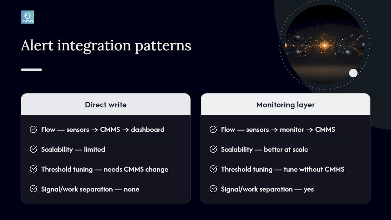
Integration between sensor networks, the CMMS, and the dashboard usually follows one of two patterns: sensors write directly into the CMMS, which then feeds the dashboard, or sensors write to a separate monitoring layer that pushes alerts into the CMMS as auto-generated work orders. The second pattern tends to work better at scale, since it separates raw signal processing from work management logic and makes it easier to tune alert thresholds without touching the core CMMS configuration.
Whichever pattern you choose, close the loop by logging every alert’s outcome, whether it led to a work order, a false positive, or a deferred inspection. That log becomes the data set you’ll eventually use to refine thresholds and prove the alert system is actually reducing unplanned downtime rather than just generating noise.
Governance, ownership and review cadence
Every dashboard needs a named owner and a data steward, and they shouldn’t be the same person. The owner decides what the dashboard shows and why; the steward keeps the underlying data clean, chasing down a mismatched asset ID or a technician logging costs against the wrong work order before it corrupts a KPI.
Review cadence should follow a three-tier rhythm: a daily glance at the operational board by whoever’s running the shift, a weekly review by planners looking at backlog and trend shifts, and a monthly strategic session where managers assess whether KPIs are actually driving decisions or just sitting on a screen. A dashboard that nobody has adjusted in six months has usually stopped earning its place.
The real risk isn’t a poorly designed dashboard. It’s a well-designed one that becomes background noise because nobody owns the follow-through.
Roll out your dashboard faster with an integrated platform
Building a dashboard from scratch across a CMMS, a spreadsheet, and a separate BI tool works, but it takes months of integration effort most maintenance teams don’t have spare. Fullyops closes that gap by generating work-order, cost, and technician data inside the same platform your dashboard needs to display, so the mapping step that usually eats weeks of a pilot is largely done before you start.
The platform’s work-order management, scheduling, and analytics modules feed the KPIs covered above, MTTR, backlog, completion rate, directly from the data technicians already log when they close a job, cutting out the manual reconciliation that derails so many dashboard projects. Because the data model is consistent from day one, asset IDs and criticality ratings don’t drift between teams the way they often do with spreadsheet-based systems.
If you’re planning a pilot on a limited asset set, as recommended earlier, a field service management platform built around this workflow can get you from data audit to a working dashboard in weeks rather than a full quarter. Request a demo to see how your own work-order data would populate a dashboard before committing to a build.
Sources
Reliable dashboards depend on reliable inputs, and most teams draw from four sources in combination. CMMS exports or APIs supply work-order fields (open date, close date, cost, technician, asset ID) that map directly to MTTR, backlog, and completion-rate calculations. Getting this mapping wrong, using close date instead of resolution date for MTTR, for example, is a common source of quietly inflated performance numbers.
IoT and sensor feeds add a different rhythm entirely. Sample rates vary wildly by asset type: a vibration sensor on a critical pump might sample every few seconds, while a temperature sensor on ambient storage might sample hourly. Edge pre-processing (averaging or filtering at the sensor level) usually happens before data reaches the dashboard, both to reduce network load and to smooth out noise that would otherwise trigger false alerts.
- Indicadores de gestão que precisam estar no seu dashboard de manutenção
- Os 10 principais modelos de painel de manutenção com exemplos e amostras
FAQ
What KPIs should every maintenance dashboard show?
MTTR, MTBF, availability, and OEE cover the core reliability picture, alongside backlog and emergency rate for work-order health.
How is OEE calculated?
OEE equals availability multiplied by performance rate multiplied by quality rate, giving a single figure for how productively an asset actually ran.
What’s the difference between a dashboard and a maintenance report?
A dashboard shows live, current status for immediate decisions; a report summarises historical performance over a set period for trend analysis.
Which dashboard type should we build first?
Start with an operational dashboard covering daily work orders and backlog, since it needs the least new infrastructure and delivers the fastest visible improvement.
Can Fullyops generate dashboard data automatically?
Yes. Fullyops captures work-order, cost, and technician data directly from daily operations, feeding dashboard KPIs without a separate manual data-mapping exercise.
How often should dashboard data refresh?
Most operational widgets work well refreshing every one to five minutes; faster refresh rates rarely add decision value and can strain system performance.
Recommended
- Dynamic graphing turns maintenance data into live decisions
- reCAPTCHA
- How to create effective maintenance reports: 5 key steps