

Dynamic graphing means interactive, real-time charts and dashboards that update as your assets generate data, built inside a cloud-based field-service or asset-management platform rather than bolted on afterwards. For maintenance teams, the verdict is simple: if a chart is still showing yesterday’s readings, it isn’t dynamic graphing, it’s a report. The right approach combines three things working together:
- Streaming ingestion from IIoT sensors, PLCs and technician devices, so data arrives continuously rather than in batches
- Contextualisation with asset metadata, linking every reading to the specific pump, vehicle or unit it came from, plus its maintenance history
- Subsecond visual updates and alerting, so a spike in vibration or temperature reaches a technician’s screen before it becomes a work order
Get those three right and metrics like MTTR and MTBF stop being monthly spreadsheet exercises and become live operational signals, queried in something like Microsoft’s Kusto Query Language and surfaced wherever your team already works.
Principais conclusões
Dynamic graphing works when streaming ingestion, asset metadata and subsecond alerting operate together inside one platform rather than as separate tools stitched together after the fact.
| Ponto | Detalhes |
|---|---|
| Define dynamic graphing correctly | It means live, interactive maintenance charts inside an FSM platform, not static periodic reports. |
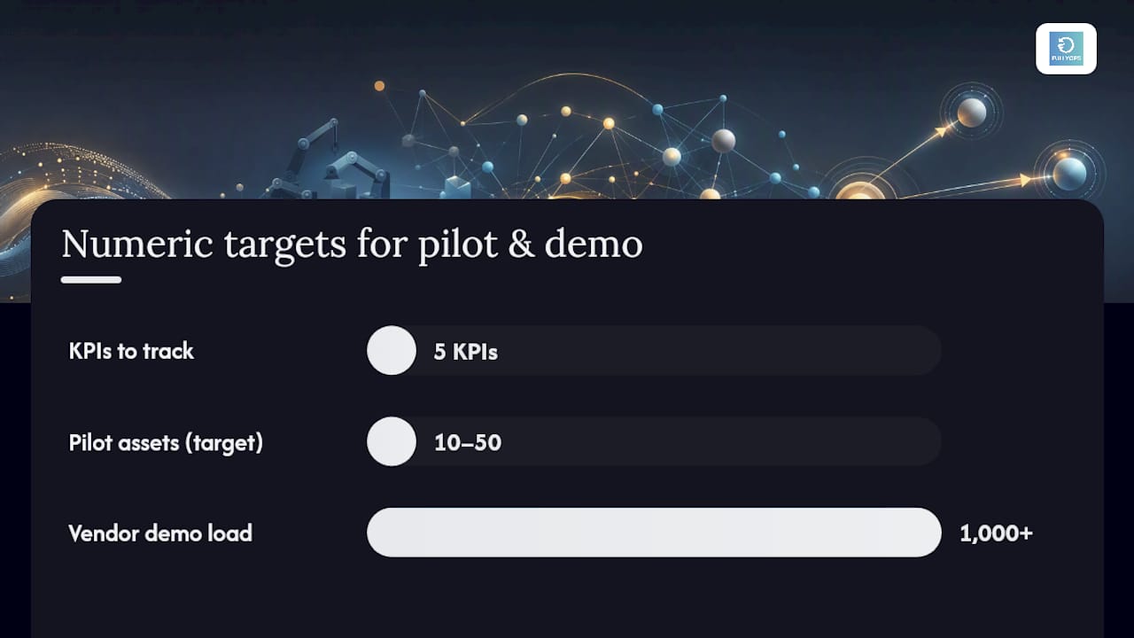
| Start with a tight KPI set | Track MTTR, MTBF, uptime, backlog and schedule compliance before adding predictive scores. |
| Demand proof, not claims | Ask vendors to demonstrate subsecond updates against 1,000+ simulated assets during the pilot. |
| Pilot small before scaling | Roll out to 10 to 50 critical assets first, with clear latency and data quality acceptance criteria. |
| Choose a platform for speed to value | Fullyops delivers ingestion, asset linking and alerting built in, avoiding a bespoke engineering build. |
Índice
- What is dynamic graphing for maintenance teams?
- Where dynamic graphing changes maintenance outcomes
- What features must a platform have?
- How does a real-time maintenance dashboard architecture work?
- Which KPIs should your first dashboard track?
- What should you ask vendors before buying?
- How do you roll out your first live dashboard?
- When should you build versus buy your dashboard stack?
- Getting dynamic graphing running with Fullyops
- Sources
- FAQ
What is dynamic graphing for maintenance teams?
Dynamic graphing, in a maintenance context, is the practice of visualising asset and work-order data as it changes, not after the fact. It sits inside your field-service management (FSM) platform or connects to it, pulling live telemetry, technician updates and inventory movements into charts that redraw themselves without a manual refresh. The industry term you’ll also encounter is real-time data visualisation, and the two phrases describe the same underlying capability: interactive charting software that treats your maintenance data as a live feed rather than a static export.
The distinction matters because most legacy CMMS dashboards are really just scheduled reports with a chart wrapped around them. They tell you what happened last shift. Dynamic charting software tells you what’s happening now, and increasingly, what’s likely to happen next based on trend data and predictive scoring.
Where dynamic graphing changes maintenance outcomes
The clearest value shows up in five recurring use cases:
- Monitorização de condições, watching temperature, vibration or pressure trends against thresholds in real time rather than during a scheduled inspection
- Alertas de manutenção preditiva, flagging degradation patterns before a failure, not after
- Live work-order status, giving supervisors a fleet-wide view of open, overdue and in-progress jobs
- Technician dispatch, routing the nearest qualified person the moment a fault is confirmed
- Spare-parts demand visualisation, spotting consumption spikes before a stockout stalls a repair
An experimental industrial dashboard tested against traditional SCADA systems reported a 47% reduction in latency and a 16% improvement in anomaly-detection accuracy, alongside a 38% gain in usability scores. Those aren’t abstract numbers. Lower latency means an operator sees a fault develop in near real time instead of during the next polling cycle, and better anomaly detection means fewer missed early-warning signs that later become emergency call-outs. Combined with reduced spare-parts holding costs from better demand visibility, this is the business case procurement teams actually want to see.
What features must a platform have?
Not every “dashboard” claiming dynamic graphing can deliver it under real operational load. Before you commit budget, demand these capabilities:
- Streaming ingestion from MQTT and other IIoT protocols, not periodic polling
- Subsecond update capability on the charts themselves, not just the underlying database
- Asset metadata linking to your CMMS or ERP, so every data point carries context about which unit, location and maintenance history it belongs to
- Historical drill-down, letting a technician move from a live spike straight into that asset’s repair record
- Time-series aggregation, rolling up granular readings into hourly, daily or shift-level views without losing the live layer
- Alerting and activator rules, so state changes trigger notifications automatically rather than waiting for someone to notice
On top of the core charting, you need operational scaffolding: role-based access so technicians and managers see appropriate views, an audit trail for compliance, defined retention policies, and integration APIs that don’t require a developer for every new data source.
Dica profissional: Don’t take latency claims on faith. Ask a vendor to demonstrate live updates against a real or simulated stream of at least a few hundred assets during the demo, and time the gap yourself between a sensor event and its appearance on screen.
How does a real-time maintenance dashboard architecture work?
A workable reference architecture for maintenance dashboards follows four phases, a pattern Microsoft’s predictive maintenance architecture documents clearly for IIoT environments:
- Ingest and process — telemetry arrives from IIoT sensors, PLCs and edge gateways via MQTT, with initial filtering and buffering happening close to the source to reduce noise before it hits the cloud.
- Analyse and transform — streaming data is enriched with asset metadata and queried using fast, KQL-style analytics, turning raw signals into contextualised events within seconds.
- Train — machine-learning models, often combining time-series forecasting methods like LSTM or Prophet with anomaly detection, estimate remaining useful life and generate a composite health score for each asset.
- Visualise and activate — real-time dashboards render the live state, cross-factory reporting flows into tools like Power BI for management review, and activator rules push notifications straight to technician devices for dispatch.
The enrichment step in phase two is what separates dynamic graphing from a raw sensor feed. Tagging every reading with asset ID, location and maintenance history means a supervisor can click a spike on a live chart and land directly in that unit’s repair timeline, rather than cross-referencing spreadsheets by hand.
On deployment, decide early whether you need subsecond or near-second latency; the former usually demands edge processing for at least the initial filtering stage, while cloud-only pipelines tend to add a second or two of round-trip delay. Storage and retention also need a policy: keep granular data for weeks, then roll it up into aggregated history for longer-term trend analysis. Your architecture diagram should show clear touchpoints for PLCs, CMMS or work-order systems, telemetry streams, and technician-shift rosters, since dispatch logic depends on knowing who’s actually on shift when an alert fires.
Dica profissional: Sketch the four phases on a single page and hand it to whoever owns your CMMS integration before you sign anything. If they can’t point to where their system plugs into “ingest” or “visualise”, you have a gap to close before rollout.
Which KPIs should your first dashboard track?
Start with a short list rather than trying to visualise everything at once. The metrics that matter most to maintenance operations, according to IBM’s KPI guidance, are:
- MTTR (mean time to repair) = total repair time ÷ number of repairs
- MTBF (mean time between failures), tracking reliability trends over time
- Uptime/availability, the percentage of scheduled time an asset is operational
- Backlog, the volume of open work orders ageing beyond target
- Schedule compliance, the share of preventive work completed on time
- Response time, from alert to technician acknowledgement
- Predictive health score, a composite indicator blending anomaly detection with forecasted degradation
Build your first widgets around a fleet health overview, a single-asset timeline with drill-down, a live work-order board, and a spare-parts demand forecast. Show confidence intervals on predictive scores rather than a single number, since a health score built on sparse sensor history is a different claim than one built on months of clean data.
Dica profissional: Label every chart clearly as live or historical. Mixing the two without a visual cue is the fastest way to erode trust in a dashboard once someone acts on stale data by mistake.
What should you ask vendors before buying?
Evaluate any platform against concrete proof, not marketing claims. During a demo or pilot, ask for:
- A live stream demonstration covering at least 1,000 simulated or real assets, not a handful of sample devices
- Query latency evidence for KQL-style historical lookups, not just live feeds
- A clear explanation of retention and roll-up policy, including what happens to granular data after 30 or 90 days
- Alerting and activator configuration, shown end-to-end from sensor event to technician notification
- Failover behaviour for edge devices during a connectivity drop
Checklist items to score against: proof-of-performance for subsecond updates, supported ingestion protocols, asset metadata linking depth, historical query speed, alerting sophistication, and export options into reporting tools like Power BI.
How do you roll out your first live dashboard?
Treat your first dynamic graphing project as a controlled pilot, not a fleet-wide launch:
- Define objectives and the two or three KPIs that matter most to your operation
- Identify data sources and map the schema before writing any integration code
- Build the ingestion pipeline, starting with your highest-value asset group
- Create the asset metadata model linking sensors, work orders and history
- Implement a pilot dashboard covering 10 to 50 critical assets
- Run operational acceptance tests against latency and alerting-accuracy targets
- Train technicians and supervisors on reading live versus historical views
- Expand to fleet-wide rollout once acceptance criteria are consistently met
Keep a rollback plan ready. Common issues at this stage, including data quality gaps and sensor noise, are far cheaper to fix at 30 assets than at 3,000.
When should you build versus buy your dashboard stack?
Bespoke dashboard builds appeal to teams with strong in-house data engineering, but they usually underestimate the ongoing burden of maintaining ingestion pipelines, retention policies and alerting logic once the initial excitement fades. The decision comes down to team capability, how fast you need value, and how complex your integration landscape already is. A team juggling PLCs, a legacy CMMS and mixed telemetry formats rarely benefits from reinventing that plumbing. A proven FSM platform earns its keep when operational continuity and time-to-value matter more than architectural control, which is most maintenance teams. Reserve a bespoke build for genuinely unusual data environments where no platform fits.
Getting dynamic graphing running with Fullyops
Fullyops gets maintenance teams to live dashboards faster than a custom build, because the ingestion, asset metadata and alerting logic already exist inside the platform rather than needing to be engineered from scratch. It tracks interventions as they happen, links every reading and work order to the right asset record, and turns that stream into operational analytics your supervisors and technicians can act on the same shift. Integrations with existing CMMS and ERP systems mean you’re not starting your data model from zero. If you’re planning a pilot, the tutorial de atribuição de recursos walks through sizing your first rollout, from choosing an asset group to setting acceptance criteria. Request a demo to see live work-order and asset dashboards running against your own data before you commit to a wider deployment.
Sources
- predictive-maintenance
- # Visual Analytics Dashboard for Real-Time Monitoring of Industrial Equipment
- Guide to Maintenance KPIs and Key Metrics to Track | IBM
- IoT-Driven Predictive Maintenance Dashboards in Industrial Operations
FAQ
What is dynamic graphing in maintenance software?
It’s real-time, interactive charting of asset and work-order data inside a field-service or asset-management platform, updating as new readings and job statuses arrive rather than on a fixed report schedule.
How is dynamic graphing different from a standard CMMS report?
A standard report shows a snapshot from the last scheduled export, while dynamic graphing streams live telemetry and work-order changes directly onto the chart as they happen.
What latency should I expect from a real-time maintenance dashboard?
Leading architectures target subsecond updates for live views, though achieving this typically requires edge processing rather than relying solely on cloud round-trips.
Which KPIs should a first maintenance dashboard include?
Start with MTTR, MTBF, uptime, backlog and schedule compliance, since these give the clearest early signal without overwhelming technicians with too many widgets.

Can Fullyops support dynamic graphing for maintenance teams?
Yes. Fullyops combines live intervention tracking, asset metadata and integrated analytics in one platform, giving teams a working dashboard without building custom ingestion pipelines first.
Recomendado
- O papel da análise de dados na manutenção: um guia prático
- Performance analysis tutorial for maintenance teams
- Predictive maintenance: boost reliability and cut downtime